Progress journal #10 stop motion
The thing that is going well into my stop motion is how the actually my stop motion is look like on my storyboard. The only thing that isn't working is whenever I was close in getting into the good part my iPad crashes. I had to make multiple parts in my stop motion and I really hate doing that. I made one slight change and that change is time has passed during the stop motion, because I would be able to edit it on my iPad so I could only leave it as day time. I've been told that my stop motion would be a bit more interesting than theirs. I would say that this project is one of my most favorite parts to do right now and the longest because I needed ideas on what to make and drawing the sketches in the stop motion. I had lots of fun making this stop motion even though its not the best out of the other people who make better stop motion than I can. I had fun with my friends helping me with taking pictures because there were certain parts that I could take with just on my iPod.
progress journal #9
|
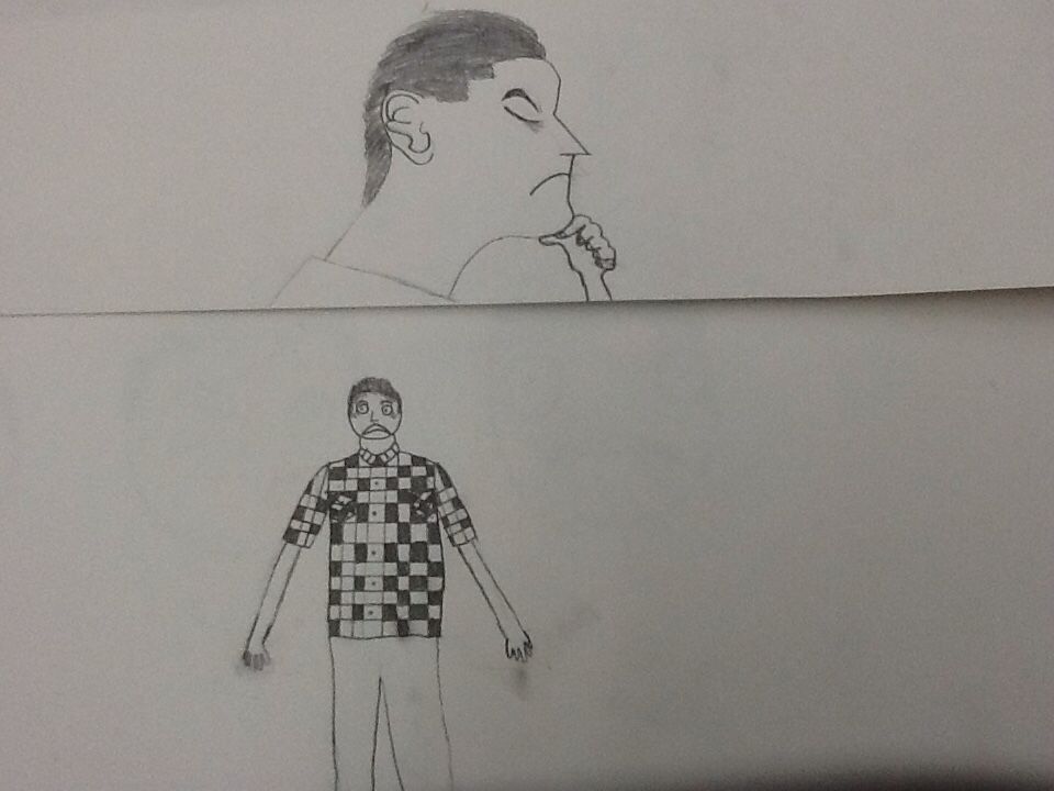
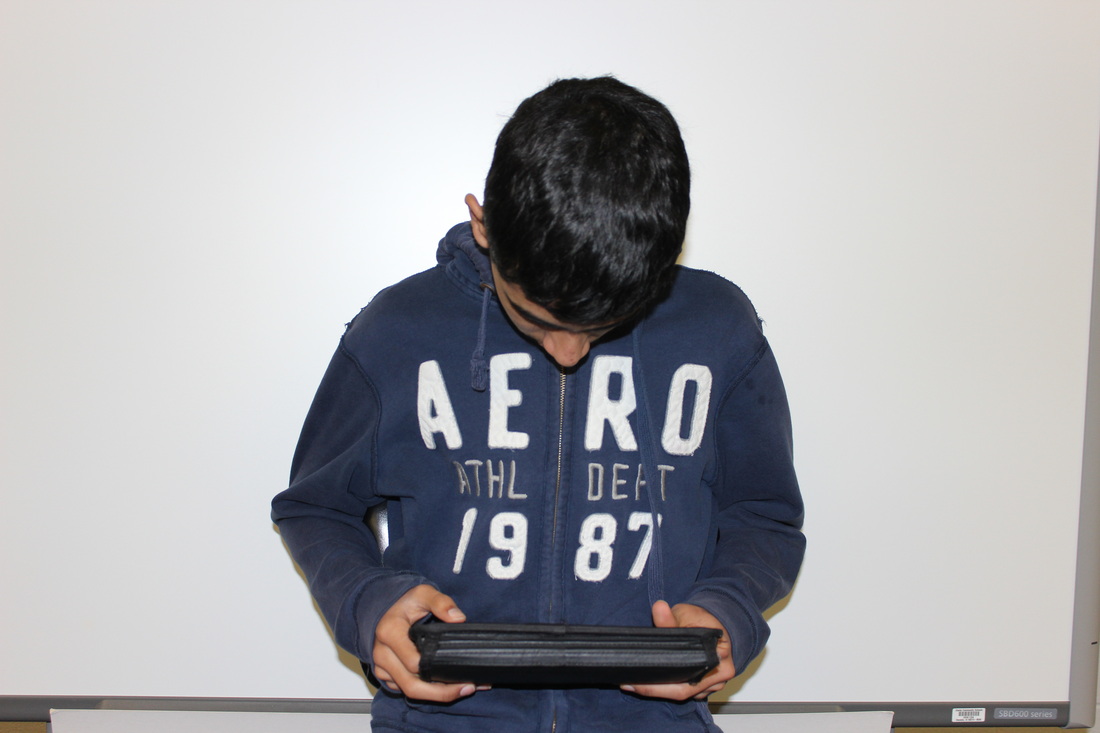
the thing that is going week on my stop motion are the artwork I'm going to put on the video. The problem that I'm running into is on how to make the shoes of my body and the hands because it's really hard for me to make hands. I tried making the best shoes and hands as I could and leve it as that. I added myself think on the top pictures on the right shows that I'm think on how I ended up in the paper. I've been told that the work look nice and people would still understand what the picture looks like from far away. I would say the making my whole body on paper and making it look pretty real would be my biggest strength for now.
|
|
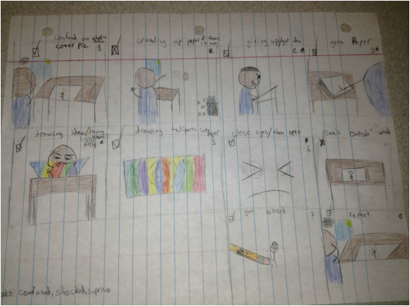
Progress Journal #8 Stop motion/Story board
|
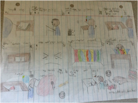
The thing that is going well on my storyboard is the part I had to change so it would make sense now. The only problems I've been running into for now is how am I going to be able to draw myself , mostly just what I'm wearing. I made a couple changes to my storyboard was when I got erased from the paper i changed it into that I accidentally spilled paint on the artwork. I've been told that my storyboard made more sense then the first draft. I want people to know that this storyboard is like a funny/ serious kind of stop motion.
|
|
Progress Jornal #7 stop motion
The thing that is going well on my storyboard how the stop motion would be about. I had some problems from parts of the slides saying that I need to add a bit more detail and have a color feeling to it. I made a change on certain parts of the storyboard but its not much change to it though. I gotten some good feedback form this storyboard but i need to find some kind of color for the background so people would know what kind of felling this storyboard is. I wouldn't really affect the process on my stop motion though. Finding a way to make a storyboard that would make sense. So people would know how much feeling is in this storyboard.
Progress Journal #6 GIF's planning
The way how the GIF is working is going great, I really like how the way its shown. The only part that isn't working is how most layers are taller than others. I've ran into multiple problems while trying to add a villager from animal crossing into my friend Martin Zaragossa's face. I did different way on how to make parts of the villagers features like the eyes, nose and smile onto him and it worked OK. I was going to have a different face on him but it seem like it would take forever to add that face on him and it would be confusing to most people. I gotten good feed back from this GIF's I've been told that I should change a little on his face so people would actually believe that its his really face and not the villager's. I gotten stuck on the part of how the villagers face would look like as if you can only see a part of his face and not the other. The reason is that I didnt see any pictures show just one part of his face all of them are just fan-made creepy ones or just his whole face.
Progress JOURNAL #5 GIF's planning
|
I've been learning on how to make GIF's on Photoshop. I gotten ideas from GIF"s that a friend has showed me. I have been running into trouble of the pictures i got for my GIF"s. I gotten told that I should have a white back ground so no other color could connect to the person in my picture when I need to crop him off. I want to make my GIF as even as possible.
|
|
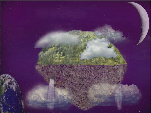
PRogress Journal #4 dream scape
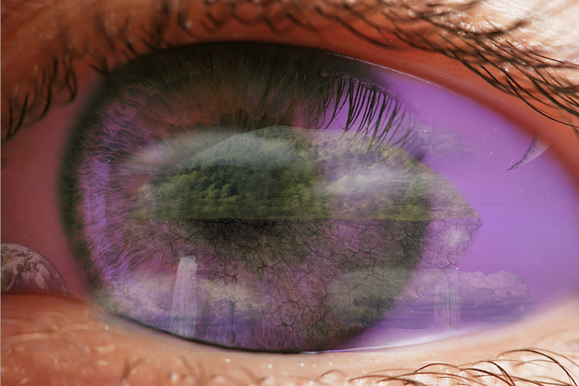
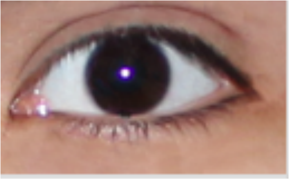
The things that are going well on my piece are the way the eye is reflecting the floating island. The only thing that isn't working or just doesn't feel right is that way the color on the eye is. Which is one of the problems I'm running into. I solved this by changing the way the color of the background is and ways it could be changed. I did change one thing which was my eye. Instead of using my eye ball i used one that is from the internet because when I tried zooming into my eye but it was too pixelated so I found a better picture. I've been told that my final piece look cool and nice but I just needed to change the parts of the background color.
Progress Jornal #3 Dream scape
The thing that is going well is the way it looks. Its looks more realistic than just a dream. The things that I think isn't working well is the way the island is shaped making it looked as if someone just put a piece of an island on dirt. I ran into some problems which were on how make the island as good as it could be. I solved this problem by adding the blur tool to it to make the clouds more realistic. I didn't really make any changes at all which I liked about this piece. I've gotten good feedback on what little parts to change and what part I need to add. One of them was that I needed multiple clouds because if I didn't then all the clouds would look the same. I think that my piece looks goods as is.
Progress Jornal #2 dream scape
|
The thing that is going well is my pictures that Im cropping, editing, and added to them.The thing that I think isn't working or feel like it needs to be edited more is my eye. It looks very pixelated and it just annoys me. But I solved it by stamping some parts of the eye with the same color to it. I haven't changed anything at all yet, but I feel like have to sooner or later. I've been told that my eye looks good as is so I might just leave that part like it is now. My artist behavior strength this week was that I was getting my stuff done before the deadline
|
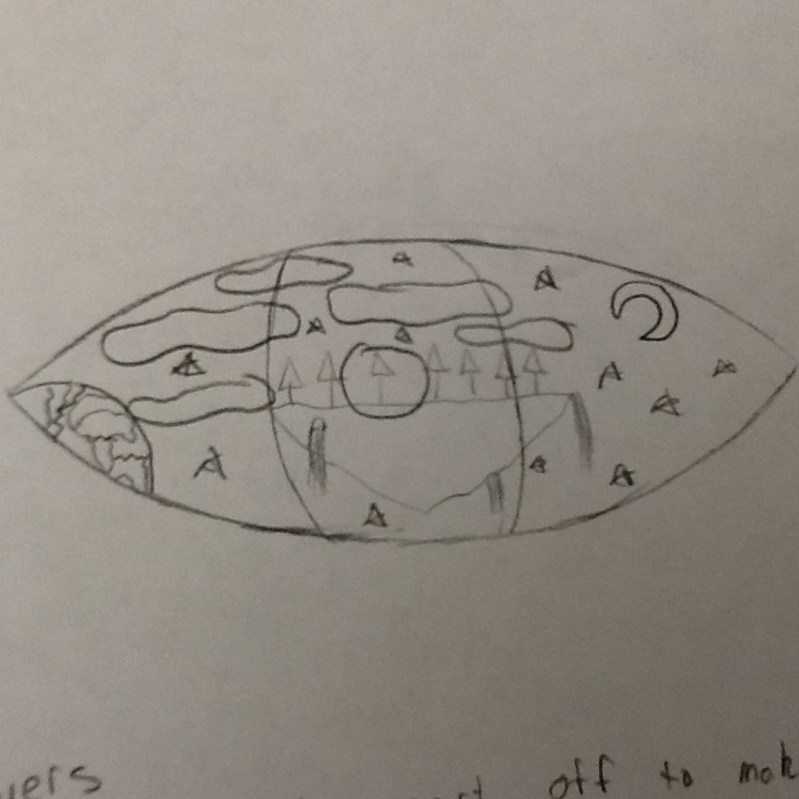
PROGRESS JOURNAL #1 dream scape
Im making some ideas of what I can make on the eye ball of my design. Im trying to see different idea I can put on the reflection of the eye ball , for example I have a design of show an open field with a floating island at the background with a bunch of clouds next to it. I've been having trouble on deciding on which design would be best to make on the eye ball. I've been asking my friends on which design looks better than others and which would look good on the reflection of the eye. I added a little bit of detail to the final sketch on my design and its looks more like a dream then a normal day. I been told that the final sketch was probably the best one out of all the other sketches because I'm trying to make a dream like design. I think the way I made different design instead of making the same layout with either different ways it can be made or different background.