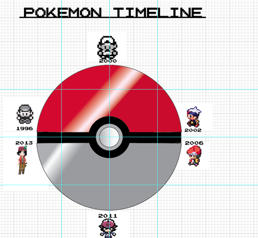
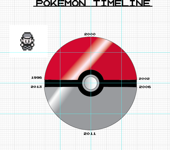
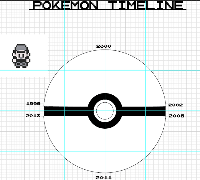
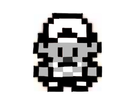
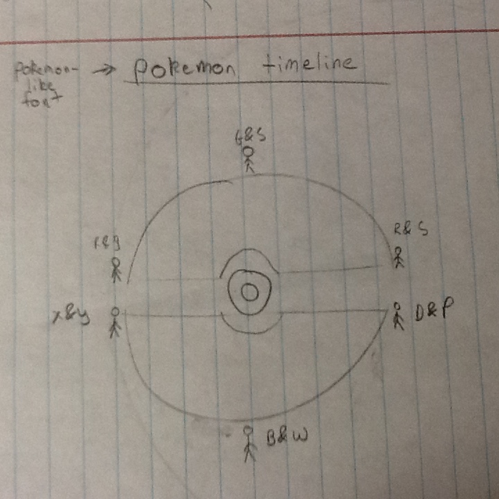
This piece grew when i made it from a sketch and had ideas about it and i added it to the final sketch. If i ever restarted again the only thing i would change is the black line across the ball i wanted to look #d and so I would have to curve the line a bit and try finding ways to make it look 3D. Over all it still look as good as is. If i never did find a way to have the pictures look nice then there would be a white box in front of the pokeball.
0 Comments
I only made a couple changes not too serious though. I just changed the font of the words on the title. Making it look 8-bit. I added a little bit of white to the pokeball so it looks like its shinning. I really like how the pokeball looks like now than it looks like on my sketch. When i showed this to my partner he said that it looks good as is.
I'm making the pokeball right now trying to figure which color would best fit for it. I've been running into the colors of the ball. When I add the red on the top it also is added to the bottom part which is the part I don't wan to to be at. I cut of the bottom part on the circle and added another circle on the bottom part. I only made some slight changes to it which was the black line a little short so it shows that it has a little bump on the ends of the circle that are cut in half.
I drew the over world trainers for each generation of the Pokemon franchise. Im showing the people who are new to the game or the old school fans of this game showing how much improvement has been made into these games over the years. When i drawing the characters its shows how much detail they put on each generation trainer. I looked up information of how the Characters looked like then and when some of then look like now. My creative skill went up when i was making this piece. If I could start all over again then the only thing I would change on this piece is the color of the house because it looks too cartoonish. Either way I still like how it looks like with the faded colors on the grass and the sky. My bigest risk on this piece was putting the color on the stairs to make it look like cement stairs, some parts are too over the line and others have too much on.
After my client told me what to change and add I tried my best of make that happen. Both the black & white version is nice but the one with color looks better. The design was fun to make trying new things on the design. I really like the dirt/gravel is going like as if the tire is moving or stoping. I only made one mistake on the logo which was the RWB it was suppose to be KWB but i changed that on the color logo.
I think my logo is 10X better than my handwritten logo. The only problems I've been running into was of making the text white instead of black because if i leave it black than you wont be able to see the text on the logo. But all i did was change the stroke and fill the change the color. I told my client the change the color of what he picked, which were blue, black and white, instead of those colors i told him that it should be black,white, and grey. I didn't want blue because that blue wont make the rest of the colors pop out.
I didn't really make any changes to my logo. He thinks the logo look good as is. I just added some adjustments to my logo like tell him what type of colors would best make that tire pop out. I would think that the tire would look nice on almost anything, like a pin, a post card, a sign, on a coffee mug, and etc.
I deiced to make a timeline of Pokemon trainers over the years. I made that timeline look like a pokeball and each generation it goes around the pokeball so it looks like as if the timeline is forming it. I looked at each generation and see how each trainer designed look liked each game and how much they improved on the design and how much has changed. I want people to know when they first played their first Pokemon game which can be whichever generation it was, I want them to know how much improvement they made in making the game.
I made the tire logo for my client. He thinks that it would best logo to show that this company is about RWB nascar. I made the logo in black and white first and see if it looks nice. I even resized the logo and see if it still readable and see if people would notice. I think people would notice it if it was on a post card, a pin, or outside. after showing my client the black and white design of the logo. I told him what colors would best fit the tire. the colors for the tire where black,white,and grey.
|
AuthorI like to watch YouTube videos. I like playing video games. Favorite genre of video games are RPG. I also like reading manga and watching anime too<3. I like taking art classes the most. I want to become a YouTuber because I want to make a fan of mine smile from my videos. Archives
December 2014
Categories |