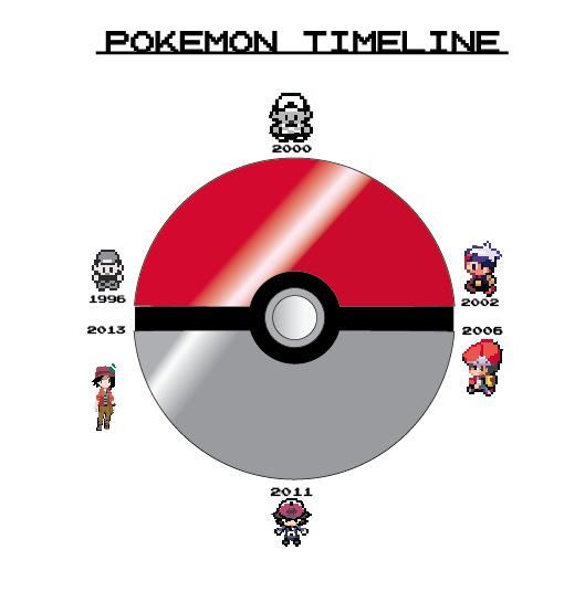
INFOGRAPHIC
MEDIA: Illustrator
Year: 2014 December
Class: Graphic and Designing I
Artist Statement: This piece gave me inspiration because when I played each Pokemon game I look how much has changed and how much of the graphics have improved. I used Illustrator to make the poke-ball and i used illustrator ideas on my iPad to draw each generation trainer. This piece shows how much I care about pokemon and how much time I worked on the piece. When they see this art they know I love playing Pokemon a lot and how much time it took for my to draw each trainer. Over all I think I did the most hours on the art than any other.
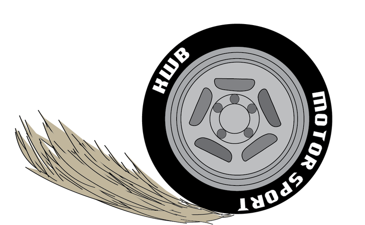
Logo design
Material: adobe Illustrator, adobe ideas, pictures from the internet, sketches,
Year: 2014 December
Class: Graphic and designing I
Artist Statement: I made this artwork because this was a project for a client that told us what kind of theme. When i heard about the theme I gotten i was like "this will be fun" because it was a challenge for me because I don't really know much about cars so it was really fun making it. I used adobe illustrator and ideas for my design. I used the simple tools for the design like the pen tool, the type phase and the circle tool. This art means to me because it was hard to find ideas for the logo and really fun when i had to make it
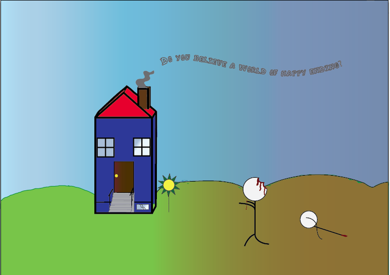
Typography
Materials: Illustrator, computer, pencil, graph paper,
Year: November 2014
Artist Statement: I made this piece because I had an idea of se what would happen if that you were at your house and you were thinking that it such a peaceful day and then out in the field you see dead less people. So out of nowhere it became from a normal day to a zombie apocalypse. I used
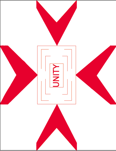
PRINCIPLES OF DESIGN POSTERS
Materials: graph paper, illustrator
Year: 2014 August
Class: graphic and Design I
Artist Statement: This artworks shows of what things you need to know of making a poster. The different ways I can make a unity poster made me feel excited because I can find different ways I can make it look nice. I used the blob tool to color in the arrows or just fill it in. I made every thing look the same shape but not the same size. I made this artwork because the way the arrows are targeting on the word unity, it looks like a target signal you see in video games, I want this art work to show that its wants to focus on the word unity and how it relates to it.